Understanding CSS layout design for PBASE Galleries: Part 6 – home page

Back by popular demand, I’m adding a new tutorial to my little series of Tutorials on understanding Pbase CSS

Customising your pbase home page

So how did I get my front page of pbase to look so different? Well I didn’t want any galleries showing, I wanted a fully customised front page from which to launch various galleries of my choice. This required not only a CSS change but also a structural change in my gallery hierarchy. Basically my front page CSS hides all the stuff that pbase would normally show (gallery thumbs etc) and formats my new code which I have placed inside the user description as new HTML.

Step 1: reorganise gallery hierarchy

So we want a new root gallery to take the place of my front page. I called mine “main”. I moved all my top level galleries into my main gallery so on my front page all that would be listed would be “main”.

Eg my tree view would now look like:

  • root (All galleries link/front page)
    • Main
      • Underwater
        • Sub galleries…
      • Travel
        • Sub galleries…
      • Macro
        • Sub galleries…
      • Other
        • Sub galleries…
      • Private gallery for storing site images

My new main gallery can just have a normal gallery css (as developed in earlier tutorials).

Now we have a new root we can redesign the front page as we’d like it to look…

Step 2: create an offline copy of your front page to work on

For the next bit it is quite nice to use an offline file to code up the way you want your page to look. Since we are redesigning the front page it is very visible while we are in the design process, luckily there is a simple way around this. But first we have to create a new style sheet for the front page (I called mine suzyfrontpage). It doesn’t have to have anything in it yet but as long as your front page is pointing at it in time for the these steps:

  1. Go to your front page of pbase
  2. View the source of the page
  3. Create a folder on your computer somewhere (I put mine on the desktop)
  4. Inside the folder create a new blank html document (you can create a text doc and change the extension from .txt to .html)
  5. Copy and paste all the page source of your front page into the new doc
  6. Save and close the doc

Go back into your real pbase front page and change the css to whatever you originally had it on and open up your new css (suzyfrontpage) in a new internet window for editing.
Ok, now you have a mock up of your current pbase screen that points to a new css on pbase. For some reason its easier to edit pbase css on pbase itself but we can use this new html to see our changes without affecting our current site too much.

Step 3: Use css to hide all pbase front page elements

Open the html file you created (it will look the same as your current pbase front page but as we change the css on pbase we will see changes on this local file instead of our real pbase front page).

We use the following css to clear the decks so that our new code (when we add it to the description of root) will be all that shows.. 1st hide the menu using arjuns code and set the genal body settings as you did for the gallery css (as before in the other tutorials):

/* --- simple code to hide the menu -- */
/* -- by arjun -- http://www.pbase.com/arjunrc*/
body table td a img { display:none;}
.thumbnails table img {display:none;}
table img {display:block;}
.display,.display img {display:block;}
.thumbnails table,.thumbnails table img, .display,p.small{display: inline;}
body div.galleryheader table td a img {display:inline;}
/**/
/*general settings for whole body of gallery and image pages*/
BODY {
 font-family:Verdana,Tahoma,Helvetica;
 color:#333333;
 font-size:80%;
 background:#6f6a63;
 text-align: center;
}

/*general settings for whole body of gallery and image pages*/
DIV,TH,TR,TABLE,LI,UL,FORM,BLOCKQUOTE,P,B,I,H1,H2,H3,H4,H5,CENTER{font-weight:normal;color:#333333;}

then we need to not show any tables on the rest of the page (this is a nice clean way of getting rid of the main gallery thumb that shows at the moment)

/*all tables not further defined*/
table { display:none;}
.gallery_hitcounts{ display:none;}
.gallery_comments { display:none;}
TD.thumbnail  { display:none;}
img.thumbnail { display:none;}

then set the page up (I decided to go for a fixed width look where its set to 804 wide):

/*gallery page*/
#page-1
{
 background:#6f6a63;
 width: 804px;
 margin-top:2%;
 margin-bottom:2%;
 margin-left:auto;
 margin-right:auto;
}

#page-1 table {display:block;}

Now we come to the nitty gritty of designing our new layout…

Step 4: designing a layout

Best designed with good old fashioned pen & paper, sketch yourself out the sections you want for your new layout. I’ll explain my layout and hopefully you’ll be able to use that as an example to design something more personal to you.

1st we have to write some html to define our layout, after that we can make it look pretty in our css.

This is how my front page looks now:

Here I have outlined in red the following sections:

1) topmenubox

2) UpperPhoto

3) LowerPhoto

4) portfolios

5) lowermenubox

<click this image to see larger>

These sections are all included within one div called MainBox. These names allow me to reference the sections from within the css later. The names are made up, you can pretty much call the sections what you like as long as the names don’t already exist within the pbase page source that you copied earlier.

So, lets get changing some code! Inside your local html file that you made eariler (you can open it with a text editor – I like Notepad++ for coding web stuff) you should be able to search for the following:

<!-- BEGIN user desc -->

This (as you may expect) is the beginning of your user description (the box you can edit from within pbase). Everything from that tag down to this one:

<!-- END user desc -->

is something we can control.

Step 5: Adding layout sections

So, in your html file delete everything between those BEGIN/END user desc comment tags (to start with a fresh user descritpion) and put the following

<div id = "MainBox">
</div>

This creates the wrapper for the main part of the layout. Put the following into your css:

#MainBox
{
	width: 100%;
	margin-bottom:2%;
	margin-left:auto;
	margin-right:auto;
}

now we can start putting elements into that wrapper one section at a time.

The first section is the top menus. topmenubox. This section is made up of 6 links. I use <ul> & <li> tags to list them instead of a table because if you remeber we’ve hidden all tables in our css already. The code works like this:

<ul>
	<li><a href="Link1">Text1</a></li>
	<li><a href="Link2">Text2</a></li>
	<li><a href="Link3">Text3</a></li>
	<li><a href="Link4">Text4</a></li>
	<li><a href="Link5">Text5</a></li>
	<li><a href="Link6">Text6</a></li>
</ul>

where Link1 is the url of the link for the first word eg: http://www.pbase.com/suzy_walker/main
and Text1 is the text of the first word eg: Galleries
and so forth for links 2-6 and Text 2-6.
That code goes between the

<div id = "MainBox">

and the

</div>

tags in your html doc (I actually made it run all together on one line and have listed it here with more structure for clarity). To wrap that list in a wrapper put

<div id = "topmenubox">

before the <ul> and

</div>

after the </ul>.

put the following in your css to style these links (it should seem pretty obvious where you can change the colour and font attrbiutes):

#topmenubox ul
{
 vertical-align: middle;
 margin:0px;
 padding:0px;
 background:#6f6a63;
}

#topmenubox li
{
 display:block;
 height: 26px;
 width: 133px;
 font-family: Verdana;
 font-size: 11px;
 font-variant:small-caps;
 letter-spacing: 0;
 color: #ffffff;
 float: left;
 text-align: center;
}
#topmenubox  li a:link, li a:active, li a:visited
{
 display:block;
 background:#6f6a63;
 color: #ffffff;
 text-decoration: none;
}
/*menu item link mouse-over*/
#topmenubox li a:hover
{
 display:block;
 background:#6f6a63;
 color: #282828;
 text-decoration: none;
}

Now for the images: Remember earlier when I said I’d choosen a fixed width of width: 804px? Well now I need to create my images to be 800px wide and the css is very simple because the html we will write holds the format. This is the css for the two main photo sections:

#UpperPhoto
{
 width: 100%;
 border: 0px;
}

#LowerPhoto{
 width: 100%;
 border: 0px;
}

And the html is simple too.

<div id="UpperPhoto"><img src="ImageLink1" width="800" height="260" border="0" alt="Gallery Image"/></div>
<div id="LowerPhoto"><img src="ImageLink2" width="800" height="205" border="0" alt="Gallery Image"/></div>

where ImageLink1 & 2 are the direct links to the 2 images you wish to use. eg: http://www.pbase.com/image/112432192/original.jpg

put this within the MainBox div tags in the html doc (but subsitute your own images of course). You should now beging to see how your mock pbase page is taking shape.

The last two div sections are basically two rows of links. One row, portfolios, is the four images along the bottom and the second row is the same set of links but as a list (like the top menu list) of links and words. This is so the user can click the image or the word and get the same link. For this I needed to prepare four images of 200px x 50px to be the images to my four hightlighted galleries (the widths would be different of course if you had more of less than four).

The code would look like this:

<div id="portfolios">
	<a href="Link1"><img src="ImageLink1" width="200" height="50" border="0" alt="Text1"><
	<a href="Link2"><img src="ImageLink2" width="200" height="50" border="0" alt="Text2"><
	<a href="Link3"><img src="ImageLink3" width="200" height="50" border="0" alt="Text3"><
	<a href="Link4"><img src="ImageLink4" width="200" height="50" border="0" alt="Text4"><
</div>

where Link1-4 are the html links to the galleries eg http://www.pbase.com/suzy_walker/reefbeasties
and ImageLink1-4 are the direct links to the prepared gallery images eg http://www.pbase.com/image/112431843/original.jpg
and Text1-4 are the alt text (the text that displays when the mouse hovers over the image eg: Underwater Galleries

The lowermenubox is basically the same set of links as the portfolios in the same order. It is the same list code as the topmenubox but with different links and text (and only four in the list).

To make the portfolios and lowermenubox links/images line up use the following in the CSS:

#portfolios{
 width: 100%;
 float:left;
 border: 0px;
}
#lowermenubox ul
{
 height:26px;
 width:800px;
 vertical-align: middle;
 margin:0px;
 padding:0px;
 background:#6f6a63;
 text-align:center;
}

#lowermenubox li
{
 display:block;
 height: 26px;
 width: 200px;
 font-family: Verdana;
 font-size: 15px;
 font-variant:small-caps;
 font-weight:bold;
 letter-spacing: 0;
 color: #ffffff;
 float: left;
 text-align: center;
}
#lowermenubox  li a:link, li a:active, li a:visited
{
 display:block;
 background:#6f6a63;
 color: #ffffff;
 text-decoration: none;
}
/*menu item link mouse-over*/
#lowermenubox li a:hover
{
 display:block;
 background:#6f6a63;
 color: #282828;
 text-decoration: none;
}

And thats it. Stick this one final thing at the bottom of your css and you are done, your local mock up of new front page is complete.

BODY { margin-top: 0px; top: 0px; }
BODY TABLE A IMG { display: inline; }
HR { position: relative; }

Step 6: Putting it live

Now all you need to do to put this live is the following:

  1. Edit your root gallery on pbase. Change the css back to your new one (the one you have been editing for this).
  2. Copy the code between the BEGIN/END user desc comment tags from your local html file that you have been working on
  3. paste that code into your user desc (as the raw code and dont add anything else)
  4. tick the box for “check if using html in the description. uncheck for automatic formatting”
  5. save gallery and view it.
  6. finish, celebrate.

Photofriday – self portrait 2009

Ok, better post this quick before its not longer Friday 😉 This week’s Photo Friday entry: ’Self-Portrait 2009’

Click image to go to see alternate sizes.

Click here to see the rest of my ‘Raja Ampat Mangroves’ gallery.

See all the other photo Friday entries (and submit your own) for ‘Self-Portrait 2009’ here. Mine is number 64 🙂

Understanding CSS layout design for PBASE Galleries: Part 5 – Go Live:

continued from part 4

Once you have your local pages looking the way you’d like  them too you’ll need to take your css file and upload the changes to pbase and apply to your galleries.

Add a new css to pbase

Go to one of your galleries and in the main gallery settings you’ll see the link for edit style sheets. This takes you to a page that defines all you style sheets. Go to the bottom where it says Create a new style sheet and add a name and click the button. This creates you a new sheet and puts in some example code for you. Delete all the sample code from the big box and paste in the code from you css test file. Then click update css button.

Apply to galleries

Now go through all your galleries (that you want the style on) and select your new style sheet from the dropdown.

The end

The great thing about this approach is, if you only have one style sheet across your whole site you can change the look of your whole site by changing one file in the future! I hope this has been helpful. Please leave a comment if you have any questions and I’ll try to answer – remember I’ve only just discovered this myself though 😉 Your comments will get moderated so may not show up straight away.

Also, my css is not perfect yet so if I find out anymore tips or issues I’ll be sure to update this. Things I’ve not covered are Pblog galleries and pblog css and I think the main (all galleries) might be different.

My gallery is here and at some point I’ll do a front page tutorial. Also, I still need to cover pblog galleries and the profile page (yes you can customise this but I’m not quite sure how yet). Let me know by leaving a comment or contacting me if you found this useful.

http://www.pbase.com/suzy_walker/

Understanding CSS layout design for PBASE Galleries: Part 4 – Other gallery modes:

following on from part 3

You have your pages the way you want them for normal mode?  Time to have a check for the other modes…

So what about Treeview mode?

Its relatively simple, heres the model:

——– TREEVIEW GALLERY PAGE: ——–

<BODY>

<table> (holding the pbase menu bar)

<table> (with treepath and treeview/slideshow options)

<h2> (the title of the gallery) – annoying not wrapped in a class in this mode

<ul> (nested List of gallery links )

<li> (line with the link and count on it)

<A> (the gallery link)

<IMG> (somewhere in the list will be the arrow to the current gallery)

</li>

</ul>

</BODY>

NB: An annoying issue with this is the H2 gallery header is enclosed in #page-1 section in normal (thumbnail) mode but is just chilling on its own directly inside BODY section for treeview mode, so if like me you want a blog style layout for your pages it all goes a bit wrong here. You can squish the width but then that is squished for the normal mode. I’ll update this if I find a workaround.

I only added this extra for my treeview mode:

/*for the Treeview*/
UL
{
width:70%;
background: white;
text-align:left;
margin-left:auto;
margin-right:auto;
padding-top:1%;
padding-bottom:1%;
}

/*for the Treeview*/
LI
{
margin-left: 5%;
}

So what about slideshow gallery mode?

Its quite simple, heres the model:

——– Slideshow GALLERY PAGE: ——–

<BODY>

<table> (holding the pbase menu bar)

<table> (with treepath and treeview/slideshow options)

<DIV: #slideshow_container> (basically the whole page with slideshow java script)

<DIV: #slideshow_overlay>

<DIV: #slideshow_image_container>

<IMG: #slideshow_image>

<h3 #slideshow_info>

<a #slideshow_title> (title of the current photo)

<span #slideshow_counter> (1 of 42 etc – image counter)

</h3 #slideshow_info>

<DIV: #slideshow_controls> (the delay 1,3,pause section)

<span: #slideshow_status> (pause text)

<a #slideshow_help> (the question mark)

<DIV: #slideshow_helpbox> (help text and more help link)

</DIV: #slideshow_controls>

</DIV: #slideshow_image_container>

</DIV: #slideshow_container>

</BODY>

I only changed a few things for mine since I wanted it centred nicely and that’s all:

/* for slide show gallery mode*/
#slideshow_container
{
width: 70%;
background:white;
padding-bottom:2%;
margin-left:auto;
margin-right:auto;
}

#slideshow_controls
{
width: 50%;
}

part 5 next: go live…

Understanding CSS layout design for PBASE Galleries: Part 3 – Image page:

continuing on from part 2

The same css file needs to be flexible enough for it to be re-used for your Image page (because that is what pbase does). This provides some interesting results and little issues to overcome. Make yourself a little page-source-grab test page of a typical image page (mine was called ImagePage.html) and save in your test folder. Change the css in the HTML so it points at the test css file that your gallery is using (see the intro post)

When you load this in your browser you may notice its looks awful! You will no doubt need to put some styles in specially for the image page and its contents. Here’s my little page map that I used to help me:

——– IMAGE PAGE: —————-

<BODY>

table holding the pbase menu bar

<DIV: #commententry> holds input form when users click post a comment.

<DIV: .imagepage#imagepage >

<DIV: .localmenu#localmenu > (tolds the one row table for the top gallery links section treepath)

<DIV .slideshow#slideshow > (this is the upper previous next in a table)

<DIV .image#image >

< table.imagetable> (the main image)

A is the link to image

<IMG.display>  (is the actual image)

<SPAN .date>   (is the date of the image)

<SPAN .artist> (is the name of the artist)

</ table.imagetable>

</DIV .image#image >

<DIV .imageinfo#imageinfo >

<h3 .title > (the title of the image)

<DIV .techinfo#techinfo >

<SPAN .camera> (camera name and link)

<SPAN .exif> (basic info and hide/show exif link)

< table> (with full exif)

td.sb (first line)

td.lid (other cells)

< /table>

</DIV .techinfo#techinfo >

<DIV .othersizes#othersizes > (othersize links)

<DIV .slideshow#Div1 > (this is the lower previous next in a table)

<DIV .copyright#copyright > (copyright in a p)

</DIV .imageinfo#imageinfo >

not in a div just a table:

#voteContainer

post a comment is just inside this table with not div or class so it is only affected by #imagepage settings and above.

<DIV:  .comment_section >

<DIV: #commentlist>

<DIV: .comment> has all the comment info -name date etc inside

<DIV: .comment>

<DIV: .comment>

<DIV: .comment>

</DIV: #commentlist>

</DIV: .comment_section >

</DIV .imagepage#imagepage >

<DIV: .image_hitcounts> (two p.small with hit counts) </DIV: .image_hitcounts>

</BODY>

You’ll notice that  some stuff has the same name as the gallery page sections. You can define these just once in the css if you want them to look the same in both gallery and image page.

NB: One really annoying thing about the Pbase html for this is the “post a comment” link is inside .gallery_comments section for the gallery but just inside a table within #imagepage  on the image page.

Also, The name/tree path on the gallery page in only inside BODY but on the image page its within #imagepage  section.

stayed tuned for other gallery styles in part 4…

Understanding CSS layout design for PBASE Galleries: Part 2 – Your own styles for galleries:

Following on from this intro post.

Right now we have our blank canvas we can begin. It can seem like a massive task looking at a mangled mess of html that we don’t really need or want to understand. We need to have a picture in our mind of how the folks at PBase have laid out our pages so we can start to style it one piece at a time. As I said I consider the HTML tags as a series on containers and each container has a name and a set of stuff that can be styled. I have gone through and tried to provide a map of the sections for a normal gallery page. The DIV and Span names are so that you can refer to each sections to define how each things looks.

——– STANDARD GALLERY PAGE: ——–

<BODY> (defines the top level)

<table> (holding the pbase menu bar)

<DIV: #commententry> holds input form when users click post a comment.

<table> (with treepath and treeview/slideshow options)

<DIV: #page-1 >

<DIV: #linkedsubgalleries >(all the other sub gallery links)

<SPAN .current >(the gallery name we r in (no link))

<SPAN .other >(the other gallery names with A link)

</DIV: #linkedsubgalleries >

<h2> (the title of the gallery)

<DIV: .galleryheader > (the user desc section)

<DIV: .thumbnails> (hold the massive table with all the image and gallery thumbnails)

<DIV: .gallery_comments >

<table>

#voteContainer

post a comment

</table>

<DIV: #commentlist>

<DIV: .comment> has all the comment info -name date etc inside

<DIV: .comment>

<DIV: .comment>

<DIV: .comment>

</DIV: #commentlist>

</DIV: .gallery_comments >

<DIV: .gallery_hitcounts > (p.small of hit counts)

</DIV: #page-1 >

</BODY>

If you set a style at the top container level it will be applied to all the little container levels until its gets overridden at a lower level. For example setting the background to blue on the BODY and the background to white on a lower level such as the H2 title bar you can see that your whole page is blue except for where the header H2 section overrides it. Paste this into your css to see what I mean.

BODY
{
background:blue;
}

h2
{
background:white;
}

Now you see the principle of this (and reading through this link http://www.w3schools.com/css/css_intro.asp will give you a much better explanation of some of the features you can apply to your styles than I can list here) you can build up your own styles. Bear in mind that the same css file needs to be flexible enough for it to be re-used for your Image page, so don’t get too into it before you read Part 3 of this explanation.

Test it in many browsers

Surprisingly the different browsers out there show pages slightly differently. I found that IE (internet explorer) was the most annoyingly picky so I designed for that and then re tested in Firefox, Safari and Chrome to make sure it looked ok in what I personally would use.

Colours
Simple colours can be defined my name eg: background:white;
For a more complex (nicer) range you may find it easier to define your colours as rgb rather than hash values (like I have). You can do that by putting something like background:rgb(100, 100, 100); and changing the numbers, most paint packages give a colour picker with RGB values you can choose from and just type in those numbers for the desired colour.

Part 3 will go over image gallery page…

Understanding CSS layout design for PBASE Galleries: Part 1 – Intro.

I’m in the process of redesigning the look of my pbase galleries, I thought I’d document my findings (mainly for myself when I forget how to do it and have to relearn when I want to change the look of the again). Let me just say I’m not a web programmer, far from it. I’m learning CSS as I do this so I’ll try as best I can to explain what I find out. First things first, what is CSS??

Most people know that a web page uses HTML to tell the browser what to display. PBase controls the HTML of the pages, which defines the content and the flow of the page (the order in which stuff gets put on screen). However we can define a CSS file which overlays this content to hide/show stuff and generally style it. You can use other peoples but if you want to design one yourself this tutorial is for you!

I consider the HTML tags as a series on containers and each container has a name and a set of stuff that can be styled. By referring to that name in the CSS you can set the style of that stuff. Here are a few links that are useful to use and refer back to through this process…

Very useful introduction and ref for CSS:

http://www.w3schools.com/css/css_intro.asp

Things to bear in mind if you want your css to look nice across different browsers:

http://css-tricks.com/ie-css-bugs-thatll-get-you-every-time/

Where to begin:

Well, we know that there are two styles of gallery you can choose from (in the gallery options)

  • Original style galleries
  • Pblog style galleries

I have only really started to look at the source for the original galleries, so we’ll start with those. The same css has to cover the style of multiple gallery modes and the image page itself so there are quite a few considerations when designing a css for pbase and I shall list all the ones that I came across here:

For the gallery:

  • Thumbnail mode (normal gallery style)
  • Treeview (like a sitemap, lists all your galleries in a nice hierarchy)
  • Slideshow
  • Are your linked sub galleries listed at the top?
  • What about when the users clicks ‘Post a comment’? How does that box look?
  • How does it look when you are logged out of pbase

For Image page

  • Normal Image page style with Exif hidden
  • Normal Image page style with Exif shown
  • What about when the users clicks ‘Post a comment’? How does that box look?
  • How does it look when you are logged out of pbase

So for ease and quickness I didn’t use pbase itself to help me design my css (I made that mistake last time). I made myself a little test harness, here’s how. I started by copying the page source (usually get the page source by going View -> Source on your browser) from one of my galleries and worked from there. It is useful to have some sort of web editor (I used Microsoft visual studio but just because it was installed on my pc anyway, you can just use a simple text editor like notepad. I wouldn’t use Microsoft word though because it does funky stuff with your web content).

Create a folder on your computer for your pbase testing. Inside the folder create a new empty text file and change the file extension from .txt to .css (mine was called SuzyGallery.css). Save the gallery HTML page source to a file called something like GalleryPage.html in that folder. Now you have the HTML as text you can see at the top there are a couple of lines that define a .css file. The first one is the pbase one and the second one is your one. Change the line that lists your one so points to the empty one you just created: eg:

Lines were:

<link rel=”stylesheet” type=”text/css” href=”http://i.pbase.com/styles/gallery2.css”&gt;

<link rel=”stylesheet” type=”text/css” href=”http://css.pbase.com/styles/120501.css?t=1241781881″&gt;

Lines now:

<link rel=”stylesheet” type=”text/css” href=”http://i.pbase.com/styles/gallery2.css”&gt;

<link rel=”stylesheet” type=”text/css” href=”SuzyGallery.css”>

Now when you open this html page in your browser(s) you will be using the css styles defines in your local copy. This way, we can start off blank and build up our understanding of the sections that make up the page(s) in a local copy that nobody else can see. By the way, when your css file is blank, the styles you are seeing are the default gallery styles from the pbase i.pbase.com/styles/gallery2.css that your css will override as you add information to it.

Getting rid of the PBASE bar at the top:

Just cut to the chase and paste this little section into your css at the top. Kindly provided by arjun, it seem to work nicely and we don’t have to think too much about how it works (phew).

/* — simple code to hide the menu — */

/* — by arjun — http://www.pbase.com/arjunrc*/

body table td a img { display:none;}

.thumbnails table img {display:none;}

table img {display:block;}

.display,.display img {display:block;}

.thumbnails table,.thumbnails table img, .display,p.small{display: inline;}

body div.galleryheader table td a img {display:inline;}

/**/

Stay tuned for part two…

PhotoFriday – ‘Wildlife’

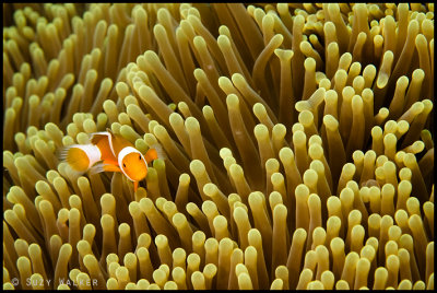
This week’s Photo Friday entry: ’Wildlife’

Click image to go to see alternate sizes.

Click here to see the rest of my ‘Raja Ampat’ gallery.

See all the other photo Friday entries (and submit your own) for ‘Wildlife’ here.

Ultimate Indonesia – Raja Ampat

Well, what can I say but what a holiday! There was laughter, there were tears, there was awe, there were men with guns and there are photos. We stayed on the seven seas liveaboard with Alex Mustard and Graham Abbot for 12 days and nights of fantastic diving in Raja Ampat. Raja Ampat is a marine protected area in Indonesia west of Papa New Guinea.

Alex Mustard

Most people in underwater photography circles have heard of him, author of a couple of books (I really liked reefs revealed), numerous articles and judge on some major underwater photographic competitions.  In person, Alex was friendly and relaxed. This was a group-lead photo tour rather than one of his specific photo workshops but he was still happy to give advice when asked (which I think we all took great advantage of) and he seemed to genuinely like sitting going through peoples photos with them. I found that it was fascinating to watch a professional photographer at work, from ideas, to subject selection, to shooting technique and finally image selection and rejection. It was good fun to dive with him, he and I almost missed lunch because we were mucking about for too long in the mangroves! As a tour lead he did a great job, especially in the airport to and from Sarong to Manado (the only place where we checked in en masse).


Graham Abbott

We were lucky to have Graham from diving4images.com as our dive guide throughout our stay on the Seven seas (I didn’t actually get to dive with the seven seas dive guide, Tommy). Graham planned the route we would take and what dive sites we would go on and in what order to get the best of our photographic time in Raja Ampat. He has a fish & critter Id book inside his head and is an amazing spotter with eyes like an underwater hawk! He showed everyone what they wanted to see and was very patient when everyone took turns to take photos of the same tiny things. He is a very funny guy, I know that Lena was especially impressed with his underwater modeling and eye crossing techniques.

Seven seas

The liveaboard was one of the most luxurious we’ve been on. The rooms were quite large (for a boat) and ours had ample space underneath the tall king-size bed to store the baggage and useful drawers for clothes and gadgets. The food was very nice, they seemed to have no problem catering for peoples dietary requirements (Alex and I dined on chicken when they served up seafood meals for example) and I never went hungry as there was a steady supply of snacks throughout the day. It seemed like there was a lot of space, it never seemed like there were too many of us. There were several spaces for us to spread out and attend to our cameras on without having to take them down to our rooms.

Diving

The diving operation was very slick. All managed by a lovely American guy called Stuart. He took video throughout the trip that we could buy at the end. The were crew great with handling the cameras and the diving gear. We had three dive boats to dive from (two tender boats and one rib). The tender boats were easier to dive from (they had ladders) but the groups on them were large. There was only ever four divers on the rib – maximum, so I was glad to be on that one with Alex, Mike and sometimes either Stuart or Graham.

The crew were very dedicated, sometimes sitting in the boats in their bright yellow rain macs waiting for us for over an hour. They seemed to know where we were at all times and when we ascended they were there on hand to help us up into the boats. Seeing how ludicrously bad I was at getting into the rib they supplied a little ladder for it which I thought was very sweet 🙂

Critters

Well, this holiday certainly had critters galore! I’ve never seen so many fish and such lush and amazing coral in one place. The few days in Lembeh were supposed to allow us to get the macro out of our system. Raja Ampat is billed as a largely wide angle paradise, and while that is most definitely true (I took more wide-angle shots in those 12 days that I have in my life) it didn’t stop the macro lenses creeping back on throughout the week when the two words ‘pygmy’ and ‘seahorse’ were mentioned. I didn’t get to see the Denise ones but I’ve never seen weedy pygmy sea horses before so was especially please to see them. It was also a nudibranch hunters dream, with all different varieties on each dive.


Also, it was the first time Mike and I had ever seen manta rays! It was very exciting to see them and they came so close and they are so big! I think I must be the only person in the world to be intimated but such a gentle creature but they are very, very big.

Mangroves
I loved the day we had in the blue water mangroves. It was such a different and special environment (I wish we’d spent a little longer really). I haven’t processed all the photos from the mangroves yet so I will do an additional blog post later on for that.

Men with guns
We travelled overnight sometimes to get to a new area. One particular morning we had arrived at a new spot, the sea was very calm and it was just past dawn. Speeding across the water was a small boat with 3 or 4 men in it, one toting a rather large machine gun. Not something that one usually sees over breakfast so it made me sit up and take notice. They pulled up and boarded, pirates I thought? Apparently not. Stuart told them to leave the gun in the boat (which they did). Apparently we were rather too close to their pearl farm and they’d had some robberies, they thought we were pirates and had come to check us out lol. Satisfied that we were just a bunch of tourists and not stashing a large oyster string on our boat they moved us on.

Tears
Well almost, I got bitten by a large angry trigger fish that snuck up on my while I was photographing soft coral in the shallows of the ‘The windows’ divesite, his shallows apparently. I was very glad I was wearing wetsuit that day! And no I didn’t take his picture, I was too busy trying to smack him with my camera while he menacingly swam at my head – eek! Luckily for me he didn’t break the skin and a got away cleaning with a massive bruise on my knee and the fright of my life.

Topside

While on a trip such as this one you don’t expect there to be much to shoot above the water (well I don’t anyway), however the landscape was so beautiful I just had to get my camera out of that housing once in a while. Stuart gave us a couple of excellent opportunities for tender boat rides around the small islands between diving. The landscape was just so very green and lush. When I looked carefully I saw a fleeting glimpse of a bright green bird and a brilliant pink bird high up in the trees. We stopped for a minute or so on a small beach with a hut, although I don’t think anyone actually lived there. It did give me a change to try my hand at another 360 panorama but when I loaded all 31 NEF files into photoshop to try and stitch it, it unsurprisingly crashed! 😉

With thanks for a great holiday to Alex, Graham, Stuart & the crew of the Seven Seas, Divequest and everyone on the trip.

click on the following to see the full set of images in each galley:
:: Raja Ampat underwater images ::
:: Raja Ampat Mangroves ::
:: Topside ::
:: Mikes Topside photos :: EDIT: Mikes cancelled his pbase so this gallery may no longer work.
:: Lembeh Strait underwater images ::

All images in this post are clickable to see larger versions and all images are copyright Suzy Walker or Michael Toye.

First few Raja Ampat photos

Just started uploading some of the photos from Raja Ampat… more to come…

Gallery here: http://www.pbase.com/suzy_walker/raja_ampat_indonesia_2009